Project Overview
Energy Makeovers came to us with a challenge: they needed to stand out in a crowded market. Their brand looked too similar to their competition, and their complex service offerings weren’t easily understood by potential customers. With services that range from residential and commercial energy solutions to a trade certificate program, they needed a rebrand that would simplify their offering, resonate with a varied audience, and—most importantly—make a lasting impression. So, we got to work.
The Challenges
Energy Makeovers has a diverse set of services, with offerings that cater to both end consumers and other businesses. Their core business areas include:
- Solutions: Direct-to-consumer energy efficiency services and products (think solar, heat pumps, insulation) and services such as energy assessments and installations.
- Trade: A B2B2C service delivered via partner channels, where Energy Makeovers offers white-labeled software for certificate generation, allowing partner companies to leverage their expertise for their own business goals.
The challenge was twofold: First, the brand had to simplify and clarify this wide-ranging service mix for multiple audiences. Second, we needed to give them a distinct and memorable brand identity that could hold its own in a competitive market.
Our Solution
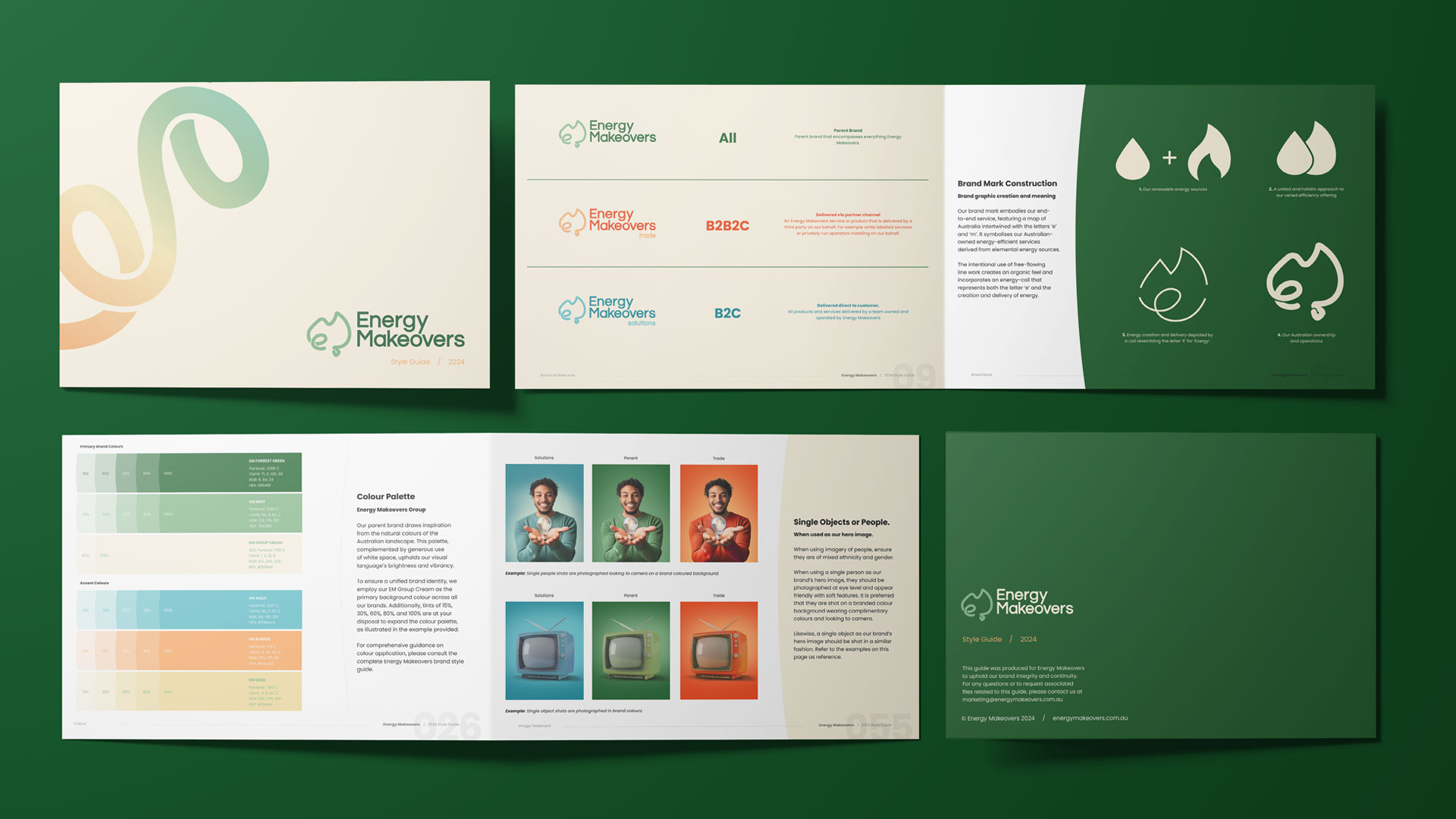
After an in-depth design thinking workshop with the Energy Makeovers team, we uncovered an opportunity to restructure the brand under a tiered approach. We broke down the brand into three main categories, each with a unique visual identity but connected under the Energy Makeovers umbrella. Here’s how we did it:
Tiered Brand Structure:
- Parent Brand: The Energy Makeovers umbrella encompasses all offerings, unified by a distinct, green brand colour to symbolise sustainability and a “greener future.”
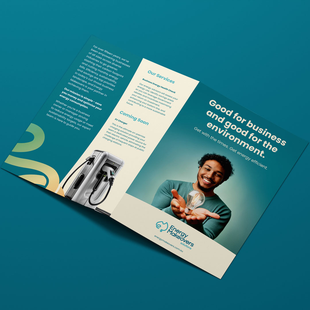
- Solutions (B2C): A direct-to-consumer offering for residential and commercial energy solutions, represented in bright aqua blue, inspired by the Barrier Reef’s crystal-clear waters.
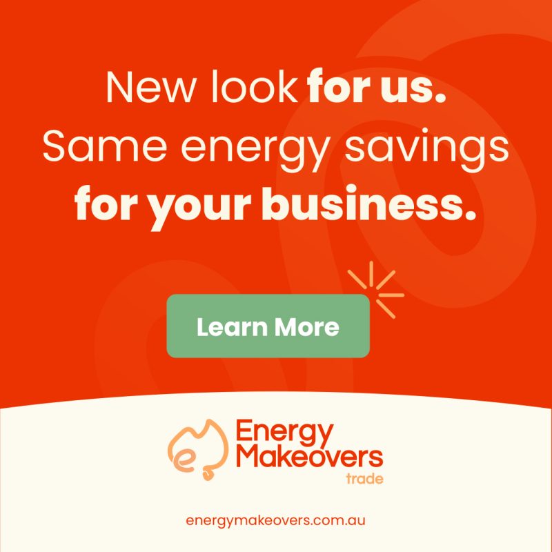
- Trade (B2B2C): This segment represents services provided through partner businesses, marked by a bold burnt orange that reflects the resilience and energy of Australia’s landscapes.
This structure, or “branded house” approach, created a distinct identity for each service area, making it easy for customers and partners to navigate Energy Makeovers’ offerings without getting lost in the details.
The Brand Mark and Visual Assets
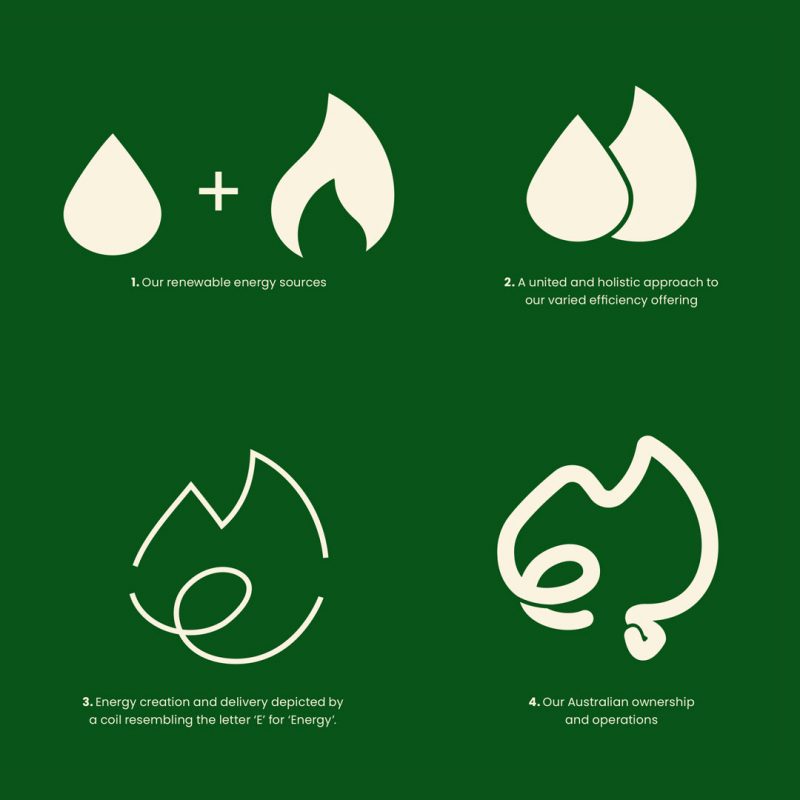
To tie everything together, we developed a cohesive visual system that unites these brand tiers. Our design team crafted a brand mark that combines natural elements (a flame and a water droplet) to create a map of Australia, symbolising both Energy Makeovers’ local roots and their focus on sustainable energy solutions. The design uses free-flowing line work and an “energy coil” to give an organic, natural feel, representing both the creation and delivery of energy.
- The Coil: Inspired by our brand graphic, The Coil symbolises the interconnectedness of the brand’s offerings, reinforcing the energy cycle and unifying all elements under the Energy Makeovers name.
- The Bump: A bendy, curved accent that adds a sense of movement and flow to layouts, The Bump creates an organic feel, perfect for accentuating space for text, images, and graphics, keeping every design fresh and engaging.
Brand Messaging and Territories
Once we had a true sense of our brand story and where we stood in the market, we identified a key brand territory to guide all above-the-line and below-the-line campaigns. “A Future Like the Good Old Days” is a brand territory that speaks to the urgency of cost efficiency and taps into a sense of nostalgia while positioning Energy Makeovers as an essential partner in sustainable, affordable energy solutions.
To ensure clarity in communication, we took a tiered approach to brand messaging, similar to a sales funnel. This approach builds brand awareness first, then establishes brand identity, and finally drives product engagement with each tier anchored by a specific purpose:
- Tier 1: Brand Message
“A future like the good old days” serves as the anchor message. It speaks to consumers’ desire to “rewind” to a time when energy was affordable and the world a little greener—presenting Energy Makeovers as a trusted partner in making that future possible.
- Tier 2: Transitional
Positioned as a renewable energy company that opens up greener opportunities, this tier clarifies the type of business Energy Makeovers is, connecting emotionally with consumers who value sustainable partnerships.
- Tier 3: Product Offering
For the final tier, we focus on specific offerings—energy assessments, efficiency systems, and white-label certificate generation—tailored for each audience (B2C and B2B), creating clarity around their specific services.

