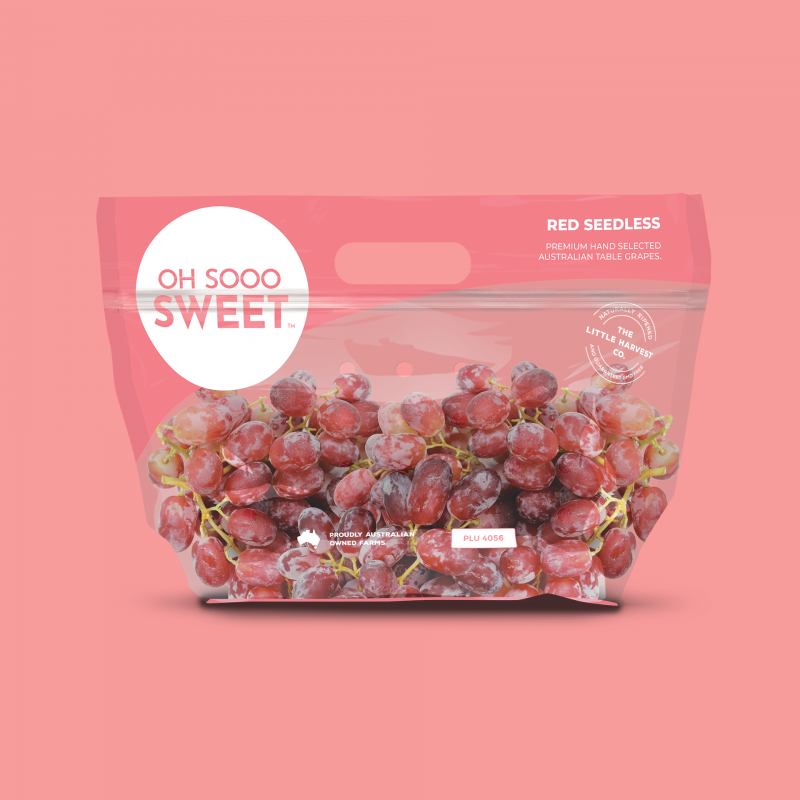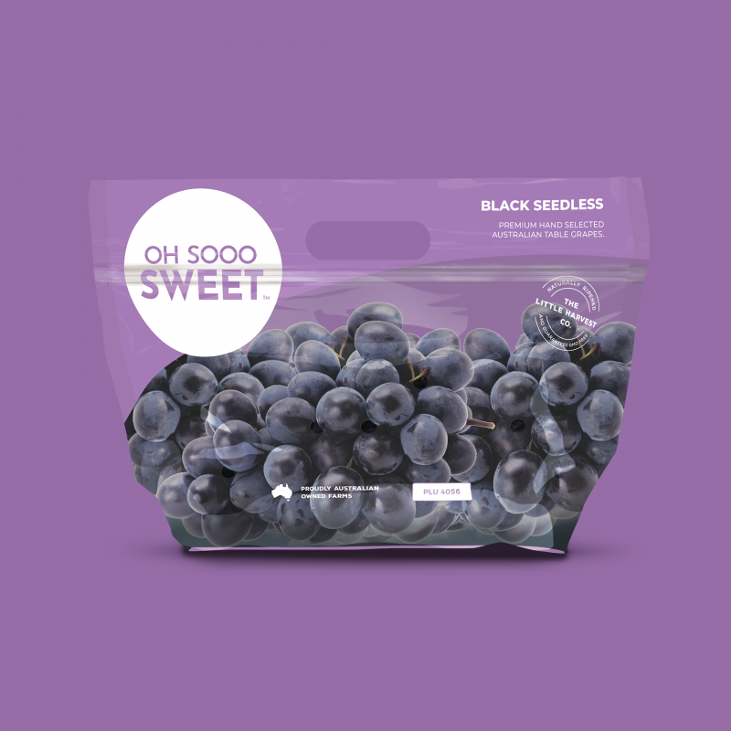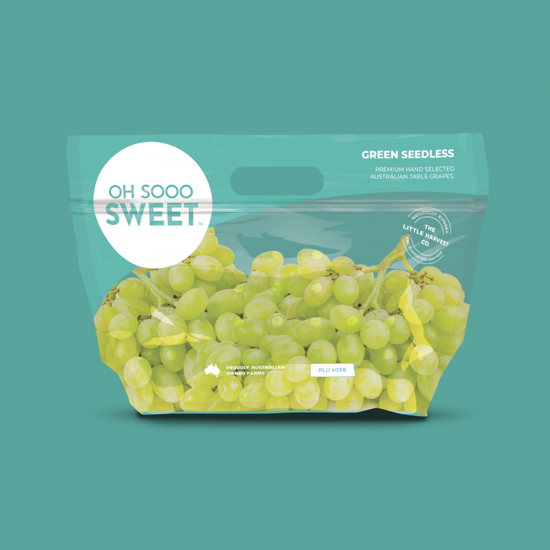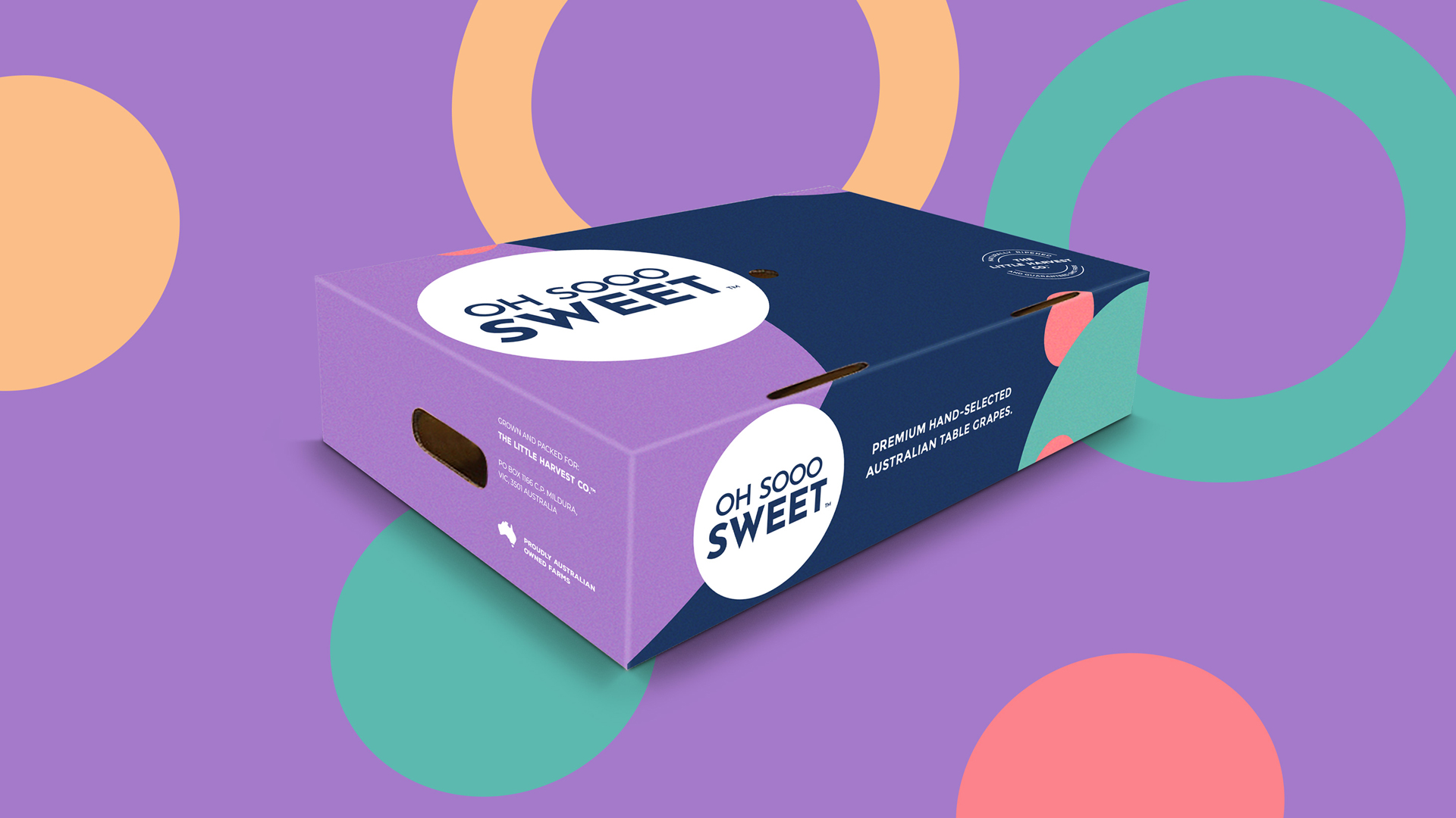


Oh Sooo Sweet embarked on a transformative journey to revitalize its brand identity and packaging design for its range of three grape types. Central to this initiative was the creation of a new brandmark, distinctive box packaging, and a comprehensive styleguide. The goal was to elevate Oh Sooo Sweet’s visual presence, reinforce its reputation for quality, and increase consumer appeal in the competitive fruit market.
The brand’s rejuvenation began with the development of a fresh and memorable brandmark. Crafted to convey a sense of indulgence and delight, the new logo combined playful typography with a vibrant color palette, evoking the irresistibly sweet flavor of Oh Sooo Sweet’s grapes. This distinctive mark served as the cornerstone of the brand’s visual identity, anchoring all subsequent design elements and reinforcing brand recognition across various touchpoints.
Complementing the brandmark, Oh Sooo Sweet introduced innovative box packaging for its three grape varieties. Each box was meticulously designed to showcase the unique characteristics of the grapes while maintaining a cohesive brand aesthetic. Bold colors, elegant typography, and appetizing imagery adorned the packaging, enticing consumers with a promise of freshness and flavor. Additionally, a comprehensive style guide was developed to ensure consistency in branding elements, from color usage and typography to imagery and messaging. This cohesive approach not only modernized Oh Sooo Sweet’s brand image but also enhanced its shelf presence and consumer perception, setting the stage for continued success in the competitive fruit market.
